Tuesday, July 2, 2013

Gray & Yellow.....the New Black & White

If you have been keeping up with trends these days you will see there is no lack of gray in today's decorating. One of my favorite combinations that is being used currently is gray & yellow. The gray needs to be warm and the yellow pure. Here are some pics of rooms that I think you will agree look amazing, along with some of my favorite choices of gray and yellow colors from Benjamin Moore.


Try Wickham Gray HC-171 to create these faint blue/gray walls. For a punch of yellow use accents in Goldfield #292.


This is a great example of a subtle use of gray and yellow. Try Plymouth Gray 1543 & Decatur Buff HC-38.


 This is a wonderful bold example of gray and yellow together. Try Kendall Charcoal HC-166 & Firefly #299.


Here is a way to use both the gray and yellow on the walls by creating an accent wall. I'm not really big on accent walls, but certain rooms and situations call for it. Try Revere Pewter HC-172 & Hawthorne Yellow HC-4 to create this look.

Monday, July 1, 2013

What about pink?

Pink is a very underused color these days. Sure, there are many a little girls room painted in pink......but what about a living room? Here are some out of the box ideas for using pink in your everyday rooms....


Our newest color pink lemonade from Color Therapy by Armistead Paint would make a great pink room!


Try latte by Benjamin Moore to re-create this almost pink look!


Try playful pink by Benjamin Moore for the perfect pink room!

Saturday, June 22, 2013

To paint or not to paint....that is the question

So many customers come in asking about painting brick. Painted brick can look beautiful but it is a pretty permanent change. Although you can remove paint from a brick surface, it requires a lot of elbow grease, and you will never get every speck off.

Now that I have painted Silver Lynx I am itching to do something about my orangy brick fireplace.

One option is to whitewash it........

Another option is to paint it all white.....

Another option is to paint it two colors.....

And last but not least, paint it dark........

If you are thinking about painting your fireplace these are all great options. I haven't decided which option I will choose yet, but I will let you know:)


Tuesday, June 18, 2013

Silver lynx -painted!


So by now you probably know what I did today......painted! Coat number 1 is complete and I'm pretty happy. Here are some before and after pictures:)


Monday, June 17, 2013

Silver Lynx

I'm so exited! Armistead Paint is about to have its own paint line called Color Therapy. Today out first gallons of paint arrived, of which I will be re-painting my living room. The color......Silver Lynx. It is a beautiful silvery gray. I am changing from a sage green so I'm excited to see the update. I will be sure to share pics:)

Saturday, June 15, 2013

The color of the day


Today's color is all about drama......Hale Navy. At first glance many may think this color is too dark, almost black, but once on the walls it is a rich, deep navy that creates a luxurious feeling in the room. You can dress the room up with mirrored pieces, silver, and gold, or you can dress it down with whites, tans, and creams. Whether you're going for elegant or upscale Hale Navy by Benjamin Moore is an excellent choice!!!
Casual setting from Benjamin Moore & Pottery Barn
Beautifully dressed up Hale Navy

Friday, June 14, 2013

I met with another wonderful client yesterday in her beautiful home. She had someone help her choose colors two years ago and she ended up hating them, so I'm glad she put her trust in me this time:) This is a common mistake so many people make.....trusting the "experts". Ok, so maybe trusting is the wrong word to use, but I feel very strongly that color is a personal thing that you just need some good advice and direction from us so called "experts".

I could see the problem immediately. The previous consultant used the kitchen granite as her inspiration which led her to some very peachy brown colors that the homeowner did not like. Funny enough, I did the same thing, with a twist. I talked to the homeowner about what she wanted and then I too used the granite (as it is a very large part of the room) and started to choose colors. While the granite has a lot of orangy brown in it, it has beautiful taupe marbling that I knew would stand out in a good way and give my client exactly what she was looking for!

So, we chose two combinations for her kitchen/keeping room. Option one is a bit warmer and lighter as she is contemplating a more feminine look, Cotswold AF-150 & Baja Dunes 997. These two colors are in the taupe/gray family but they are still more brown with a slight red undertone. Option 2 is Indian River 985 & Iron Gate 1545. This look is a bit more gray but very sharp and would give her the wow factor. Now it's up to her to decide which look she wants, they are both great looks but she will decide which one she wants to live with.

As a side note, she has a beautiful dining room off of the kitchen that has a gorgeous silvery/green/blue wallpaper on it. She wanted to make the ceiling pop with maybe a dark and dramatic chocolate brown. After a look at it I told her it may take the "pretty" feeling away from the room so we opted for a pearlescent ceiling. Veil Cream is a Benjamin Moore pearlescent and it is going to dress that ceiling up and make it so beautiful......I hope she shares pictures:)
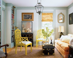