Monday, April 26, 2010

Bold Colors in Small Spaces


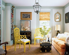
The ultimate question purposed today....can I use a bold color in a small space. The answer, YES, after you answer a couple of questions first. We have all heard the tale that dark colors make a room feel smaller, while this can be true, I like to think that it makes a room feel cozier. If the intent is for the room to feel open and spacious don't use a dark color, stick with whites and neutrals. However, if the goal is to make the room feel comfortable and cozy, by all means have at it. Try a dark charcoal color on both walls and ceiling against a crisp white on the cabinets and accessories in a small space such as a mudroom or laundry room (For the look in the picture try Westcott Navy 1624 against China White trim & cabinets). It's all about the contrast in the room. If you use a navy on the walls be sure to use a light color on the trim and furnishings. This is not to say that a monocromatic look can' t work, just save it for the larger rooms in the house!

Wednesday, April 21, 2010

Simply Whites


It seems that white would be one of the easiest colors to choose for your home......not the case. With colors like white and beige small differences can make all the difference in your home. I am often asked the question "what are the most popular trim colors". This can vary depending on what type of contrast you want between the walls and trim. If you are looking for a cream Navajo White, Linen White, or Timid White OC-39 are good choices. Navajo is the darkest of the three and has the most brown. Linen White is creamy with an orange undertone. Timid White is a newer trend because it does not have the warm orange undertone of the other two, but a cleaner creamy feel, almost heading down a green path. If you want a color that is white, but not glaring try White Dove, Acadia White OC-38, Simply White oc-117, or Mascarpone AF-20. White Dove has more of a gray undertone, Acadia has more yellow, Simply White is clean and creamy, and Mascarpone is in between Simply and Acadia. The trends change so often, however, the trend I see on a day to day basis is for the cleaner whites that I just mentioned! (The cabinets above are painted in Simply White).

Thursday, April 15, 2010

Suprising Exteriors

It's been a week since I have had time to post and a lot has changed. It's as if here in Georgia we have gone from winter to summer and just skipped over spring (with the exception of the pollen). The weather turning warmer is a sure sign that it is time to start working in the yard, planting flowers, and of course, exterior painting and staining. Today I was working with a client who lives in a very traditional home. This home is a two story with reddish orange brick. There is very little "paintable surface" but just enough to make an impact. There are stucco elements on the home along with trim mouldings. Currently the home is painted with a green on the shutters, such as Essex green and a beige on the trim and stucco, not too different from Barely Beige. In order to update the home, but not go too traditional we chose HC-87 Ashley Grey for the trim and HC-78 Lichfield Gray for the stucco. In a bit of a bold move we chose AF-180 Wenge for the shutters and door, this color is a dark color that has a heavy purple cast to it. It will pull the dark shades out of the brick and give the house a little more of a contemporary feel, which is exactly what we were going for!

Thursday, April 8, 2010

The Finishing Touches


It's been a great week here....spring break with the kids....but now it is back to business. To finish this home we chose #211 Stony Ground for the kitchen and a color somewhat similar to #25 Pigeon is in the great room and the enclosed breezeway with a 25% formula on the trim. The icing on the cake was......#26 Down Pipe. At the end of the breezeway there is a beautiful"maze like" piece of art that hangs on the wall in front of a color not too different from Fawn #10. We decided on Down Pipe for that piece of art to shorten the breezeway and make it feel like it was part of the house. The colours on the left are very representative of the Farrow & Ball look. The top two remind me of Blackened #2011 & Pavillion Gray #242 and the bottom color is Down Pipe #26.

Saturday, April 3, 2010

Moving Along...

Okay, busy day today, but we need to keep moving here. The existing living room and sunroom colors will stay as they are and they are close to #44 Cream and #206 Green Ground but we will change the trim color from white to Matchstick #2013. The next space is a long hallway that leads from the foyer and connects the family room, dining room, and kitchen together. We chose Old White #4 to use for the walls and #201 Shaded White for the trim. This works nicely because the old white was used in the dining room as the trim.

Friday, April 2, 2010


It's early, but I see a bright new day full of color! As promised I will continue my story of the fabulous Buckhead home I worked in yesterday. Off of the foyer, to the right, is the dining room. There is a large entry way into this room so all of the colors have to flow together. The current walls were pretty, but they were a 15 year old strie and the client was ready to update them. We chose French Gray #18 for the walls and Old White #4 for the trim, a beautiful combination. The French Gray is a very grayed down blue with a hint of green. The Old White is a warm taupe, also with a hint of green, which makes them a perfect pair! The ceiling has an existing wallpaper, which will not be changed, however, the subtle gold tones compliment the new colors brilliantly!

Thursday, April 1, 2010

Today is the first day of the rest of my life........


Today is the first day of the rest of my life......no it's not that serious but I am excited to create a new way to express how I feel about color! Let me introduce myself, my name is Kristy and I am a Color Consultant in Atlanta, Georgia. Every day of our lives we see color, but each of us sees it differently....that's what makes it so hard to choose!

Today I met with a client who had a fabulous house and it was decorated impecably, however, there was one thing wrong with it....the colors. In some cases it was just the trim was wrong, in some cases we had to change from the ceiling all the way down, and in one case it was painting a piece of art hanging on the wall. The client specifically wanted a historical look and preferred a mono-chromatic color scheme (which means we will need to uses varies shades of colors that do not offer a large amount of contrast). We used all Farrow & Ball colors and they are going to bring the whole place together. The home is historic and the walls need to tell a story, this is exactly what these new colors are going to do.

Over the next few days I will write about this project but I will give you a first look at where we started. It was the foyer....a beautiful wallpaper with warm but muted yellows and neutrals covers the upper walls. Below there is wainscotting in a coordinating color but......the trim.....stark white. There was a disconnect between the walls and the trim because of the harsh transition. We chose to paint the trim Matchstick #2013, Farrow & Ball describes this color as a warm color, just what we needed to tie the space together.