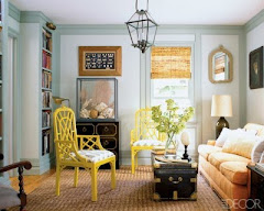
I met with a client today who needed help choosing a main color for the inside of her home. Before she called me she had planned to use the color she had used in her last home because she loved it so much. Problem was that when she sampled it on her walls it just wasn't right. It's funny how a color can look amazing in one situation and down right bad in another. Although Edgecomb Gray HC-173 had good contrast in her last home, because of the dim lighting in her new home it looked almost identical to the trim.
 Grant Beige
 Manchester Tan
 Revere Pewter
After trying several options we found the perfect color.....Revere Pewter HC-172. RP is on the same color chip as the Edgecomb Gray but it is a little bit cooler and has a very slight green undertone. We tried it on all of the walls in each room as it looks different from one space to the next. It seems to be the perfect color that she was looking for:)
Upstairs we had a challenge in the Master Bedroom and Bath. Once again, my client preferred the cooler colors, however, the bathroom had tumbled marble tiles that were mostly beige, with a very slight gray vein. We decided to go with Grant Beige HC-83 in the master bedroom and HC-81 in the master bathroom. GB is warmer than the Revere Pewter without being too gold, it still has a gray quality to it. The Manchester Tan is a bit lighter and works great with the tile. We found that if we put the GB in the bathroom it enhanced the gold in the tile, which we wanted to avoid.
No comments:
Post a Comment